10 Steps to Creating a Landing Page That Converts

Step 1: Establish your USP
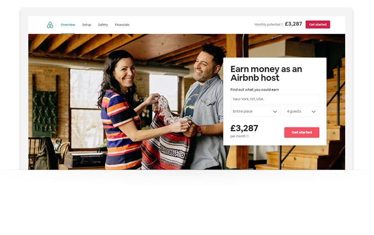
Your USP (Unique Selling Point) is the thing that sets you apart from the competition and the reason why people will choose you over everyone else. Studies show that you have less than 15 seconds to capture someone’s attention when they land on your website. That’s how long they’ll stick around before deciding whether what you’re offering is right for them. So you need to impress them, quick. Define a strong, value-driven USP and build your landing page around it. You can do this with headlines and images (we’ll talk more about those soon), or by including a value proposition in your landing page copy. A value proposition is a key component of your small business marketing strategy, and shows the user what they’ll gain when they take action, whether that be filling out a form or making a purchase. Value propositions include:- Showing how your product or service compares against a well-known competitor
- The ROI that can be achieved
- The monetary value of the product and the saving that can be made by signing up now
- The success that can be achieved
- Making it clear that your offer is free
- A guarantee
Step 2: Keep the design clean and simple
Everything about your landing page should be geared towards getting the user to complete the transaction. This means removing anything that might draw their attention away from your offer. Make your landing page full width and height, and remove navigation features. This isn’t to say you should scrap scrolling completely, but you should take away any visible arrows or buttons that encourage it. Make the most of white space too. Sometimes, what you leave off the page is as powerful as what you include. White space removes congestion and gives the brain space to think. It also forces the eyes to focus on your offer. Take a look at how the AWeber homepage keeps things simple and clean: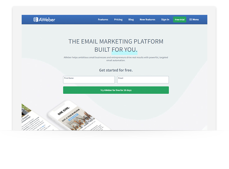
Step 3: Create headlines that hit home
A landing page will live or die on the strength of its headline. This what grabs a visitor's attention and compels them to find out more about your offer. Studies show that as many as 80% of people will read the average headline, but only 20% will read the rest of the copy, so it’s important that you nail this part of your page. A good headline should:- Immediately grab the attention of your visitors
- Tell the visitor what your offer is about
- Be short and sweet
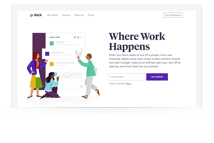
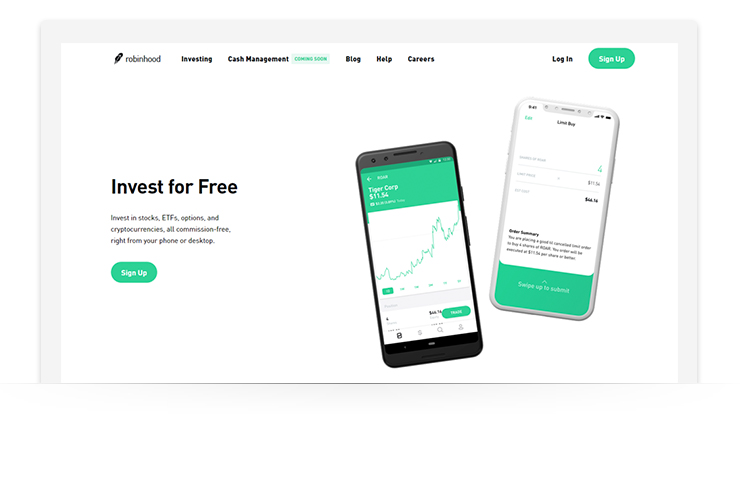
As does Robinhood.
Step 5: Grab attention with images
Images are a huge part of landing pages that convert. They’re the first thing that catches the visitor’s eye before they read the headline.
Images are processed 60,000 times faster than text by the brain, so what the visitor sees will influence their immediate opinions about your brand and offer.
Like headlines, use imagery to grab attention. Make them relevant to your product or service.
- If you’re offering a product, your imagery should be of the product
- If you’re offering a service, your imagery should relate to what the service is in a way that paints a positive picture in the mind of the user
Remember that you don’t have long to make a good first impression. Make sure images are large and high-quality. Try to stay clear of stock imagery — you don’t want to show visitors something they may have already seen.
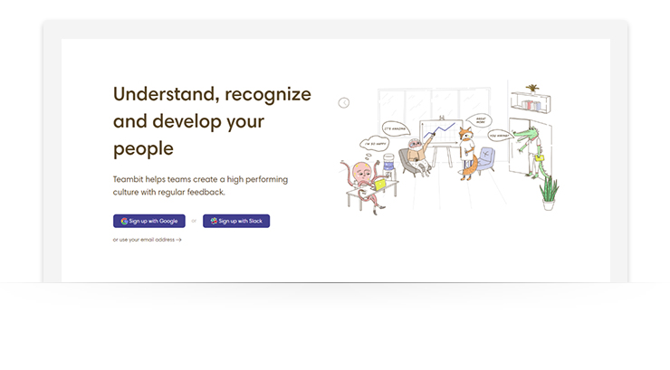
Teambit, an employee engagement and performance management platform, is a great example of imagery done well — original illustrations used to capture attention and promote its service:
Step 6: Talk up the benefits (but not too much)
Including benefits on your page is a way to reassure and persuade visitors that are on the fence. They back up your USP and headlines, and provide users with more information about what you offer.
When it comes to writing out the benefits of your offer, focus on clarity. Clearly explain how what you’re offering can solve the user’s problem. But do it in as few words as possible.
According to MarketingProfs, landing pages with more than 800 words have a 33% lower conversion rate than pages with less than 200 words. Bullet points are a great way to keep things concise and make benefits easily digestible for the user.
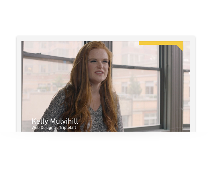
Of course, not everything has to be written. Video is a powerful persuasion tool. Research by Eye View Digital shows that using videos on landing pages can increase conversions by 86%.
Codecademy uses both video and copy for its benefits, dedicating a full section of its landing page to the former:
Step 7: Add social proof
88% of consumers trust online recommendations as much as personal ones. If you’ve got people that have used your product or service and are happy with it, use their feedback to your advantage.
Including social proof is one more way to convince visitors that your offer is as good as you say it is. It can be added to your landing page in a number of different ways.
- Customer case studies or testimonials
- Recommendations from influencers or industry experts
- Number of users
- Certifications from trustworthy industry bodies
- Showing how many of the user’s friends use your service
By the time users get to the social proof section of your landing page, you’ve already captured their attention and interest. What they’re looking for now is confirmation bias — a reason to back up what they’re already feeling.
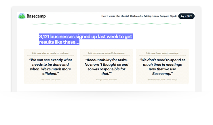
Basecamp does this well by combining number of users and testimonials for some strong social proof that supports the strength of its offer:
Step 8: Include contact information
Contact information tells the visitor that you’re a real company. It lets them know that there’s someone behind the landing page, which increases trust.
Including a physical address and contact phone number is the most basic way of adding legitimacy. What those things don’t do, though, is encourage contact. If you want to be helpful to visitors, give them a way to get in touch online. There are three ways you can do this.
- Include a chat pop-up that follows the visitor down the page, making you available to answer any questions
- Include a contact form on the page
- Include a contact call-to-action that clicks through to a dedicated contact page
Step 9: Make calls-to-action strong and clear
Every element of your landing page is designed to get visitors to notice and click on the call-to-action.
Include calls-to-action throughout your landing page, placing them above the fold, at the bottom of the page and two or three times in between. In terms of how it should look, there are some standard rules to follow:
- Make it big enough not to be missed
- Always use a button. People are conditioned to expect a button, don’t throw a curveball at them
- Use a contrasting color that attracts the eye
- Use words that are valuable and actionable (e.g. “Get your Free Trial,” “Buy Now,” “Download Now,” etc.)
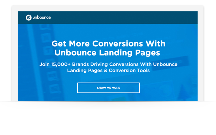
Unbounce places their call-to-action front and center where it's impossible to miss:
Step 10: Test, test, test
Landing pages are trial and error. Once you’ve created a page you’re happy with, don’t put it live and just leave it. Always monitor performance and iterate. Look at your analytics weekly and look at performance over time. Use heatmaps and scrollmaps to see how people are interacting with the page and use the information to improve.
If your page isn’t bringing in the number of leads or conversions you expected, tweak elements of the design or copy, or tinker around with the color and positioning of buttons.
Then, run A/B tests to see how the different pages perform against one another. From there, you’ll be able to take the best elements of both to produce a page that gives you bang for your buck.
Related: 6 Email Split Tests You Can Set Up in 1 MinuteConversions are only the first step
Your landing page converting is a sign that a) it’s working, and b) people are putting their trust in you to deliver on what you say. Repay trust and reward loyalty by emailing customers with content that adds value, personalized offers, and freebies, or letting them know when they left items in their cart. Every dollar spent on email marketing has an ROI of $44. Once a person has opted-in to your email list, use it to your advantage.
Related: How to Get Your First 50 Email Subscribers in 30 DaysNot sure what to include in your emails? Download 45+ free writing templates to learn how to craft emails like a pro.
About the author: With nearly a decade of digital marketing experience, Chandal has created content strategies for both the biggest and sometimes the most unexpected markets, while developing strategic relationships with editors and publishers. Chandal contributes to some of the highest authority industry publications, has been featured in industry events and is thrilled to be Acquisio’s Content Director.The post 10 Steps to Creating a Landing Page That Converts appeared first on Email Marketing Tips.
from Email Marketing Tips http://bit.ly/2SKEUJf
via
No comments